BRANDING
*
BRANDING *
mindreach
Problem
As a start-up business specialising in ADHD diagnosis, this company needed an identity that permeated through a congested industry.

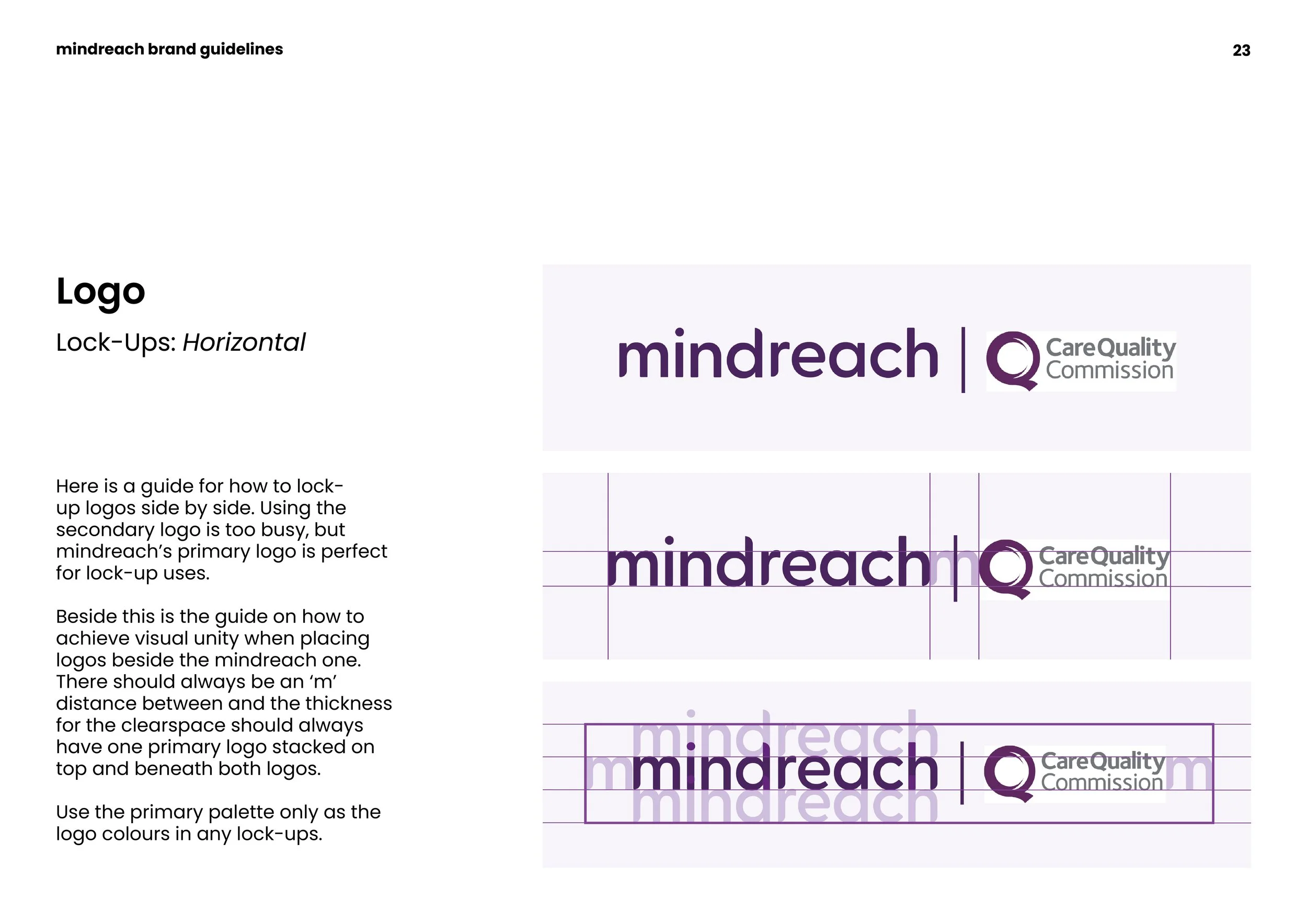
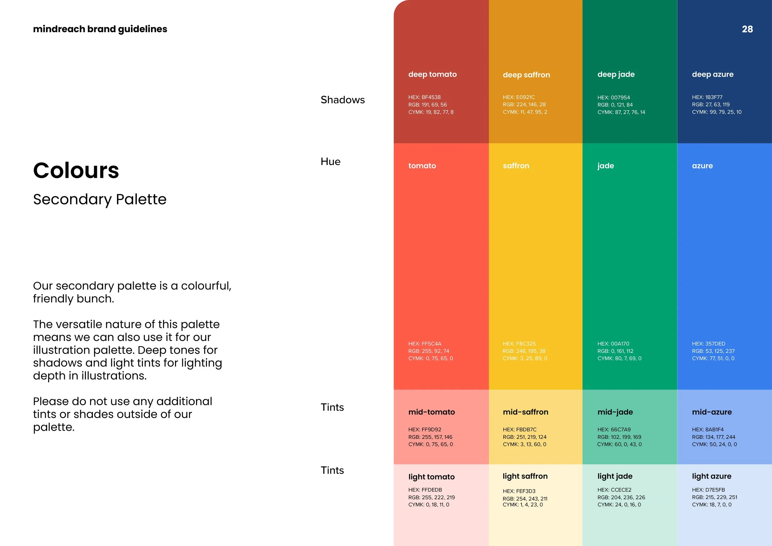
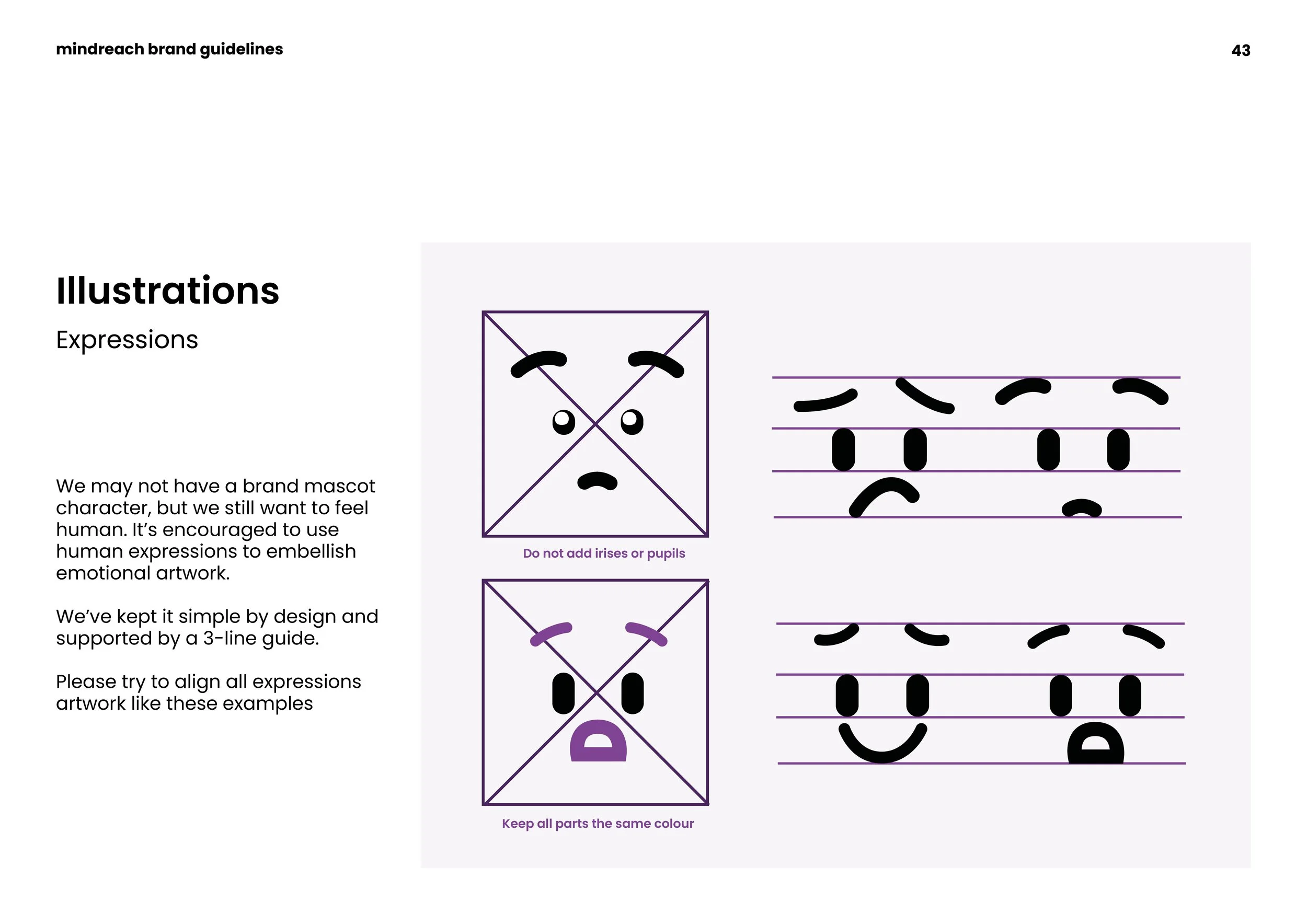
Solution
I designed the identity of mindreach, embodying its bright and compassionate voice. With thorough brand guidelines expanding from brand positioning to illustration guidelines, the foundation was built. I also created the initial social media templates, branded up documents and assisted with web design.
Profici
Problem
There was a large gap in brand presence and consistency across major marketing channels. With new branding in place, there needed to be a designer to implement it.
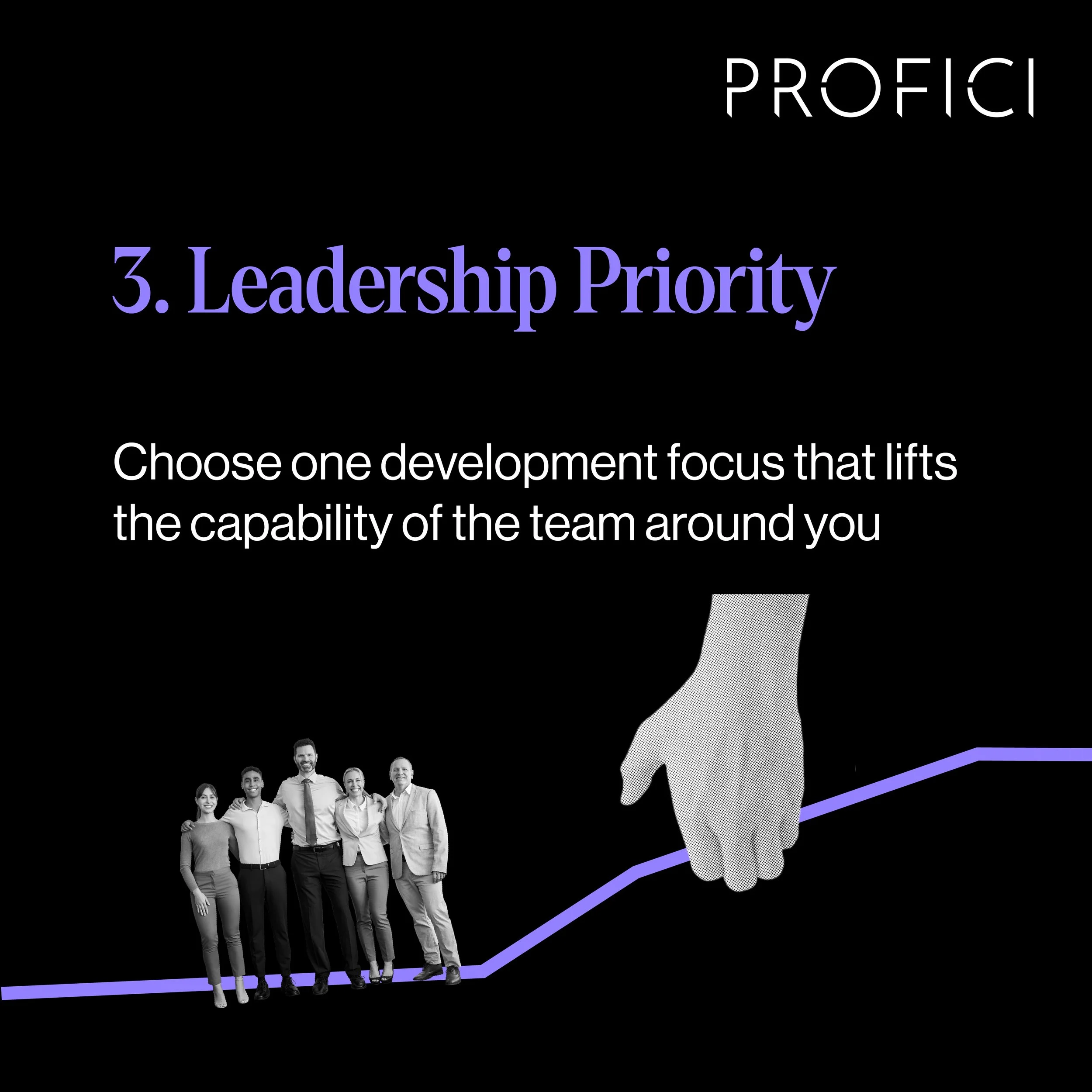
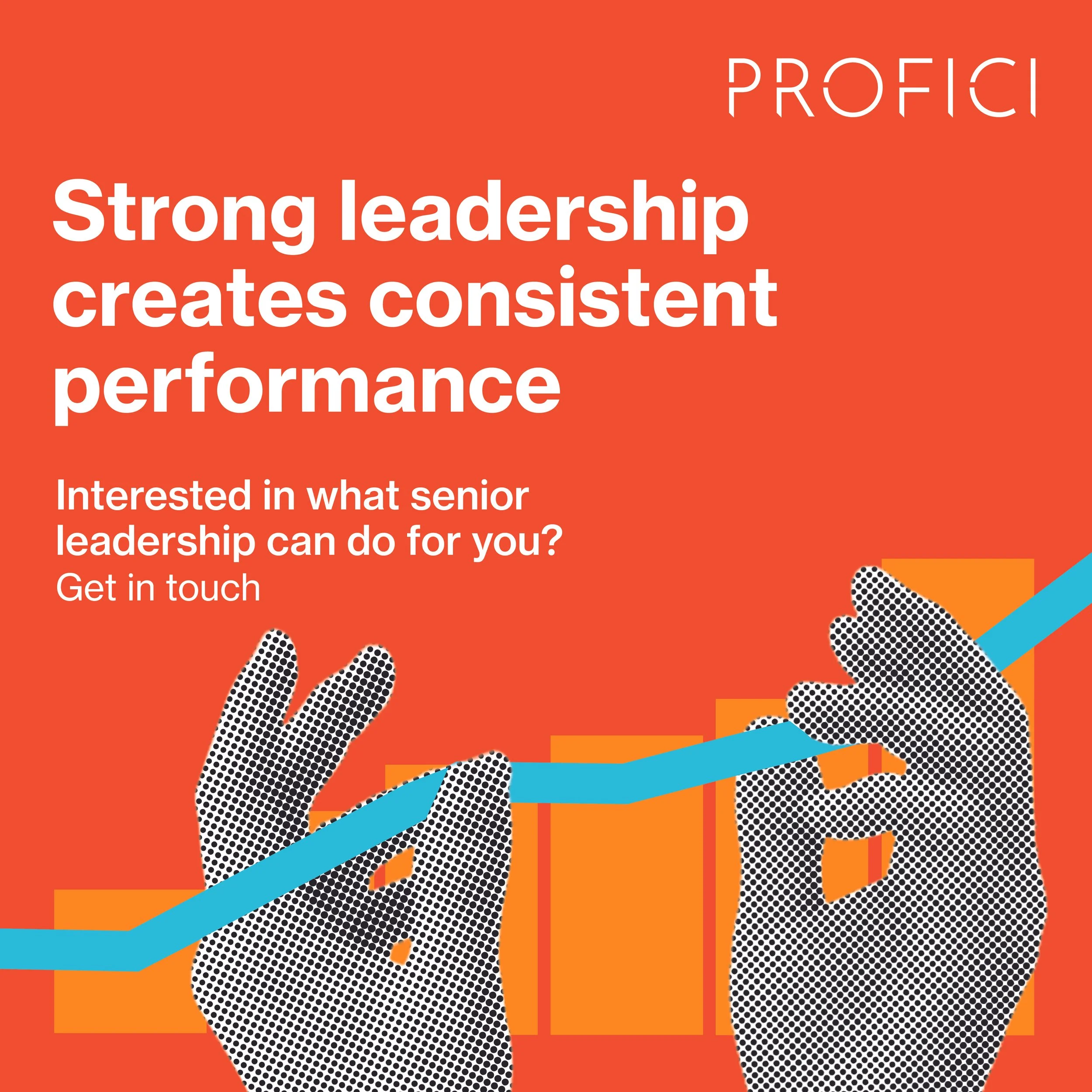
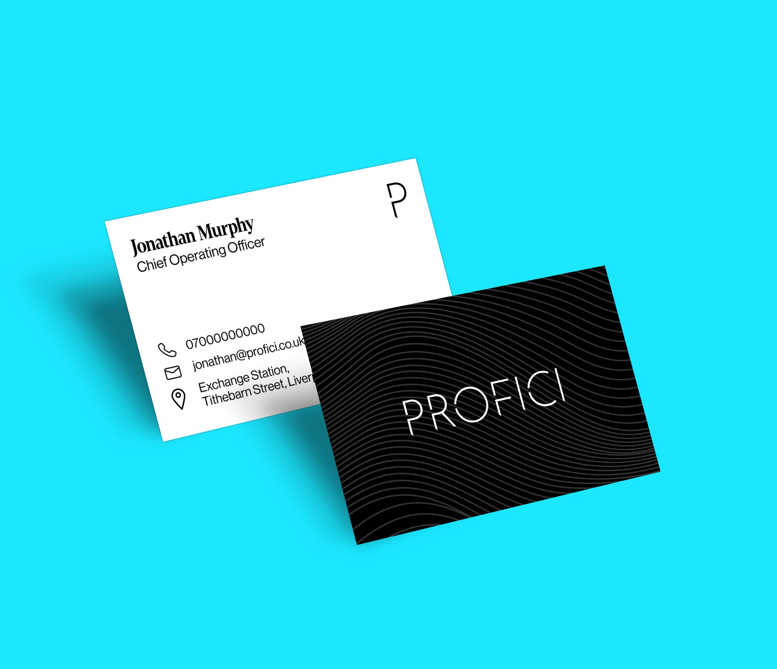
Solution
Collaborating with the creative director, I produced all of the visual content across the brand, including SEO optimised case studies/whitepapers, social media and promotional print campaigns.
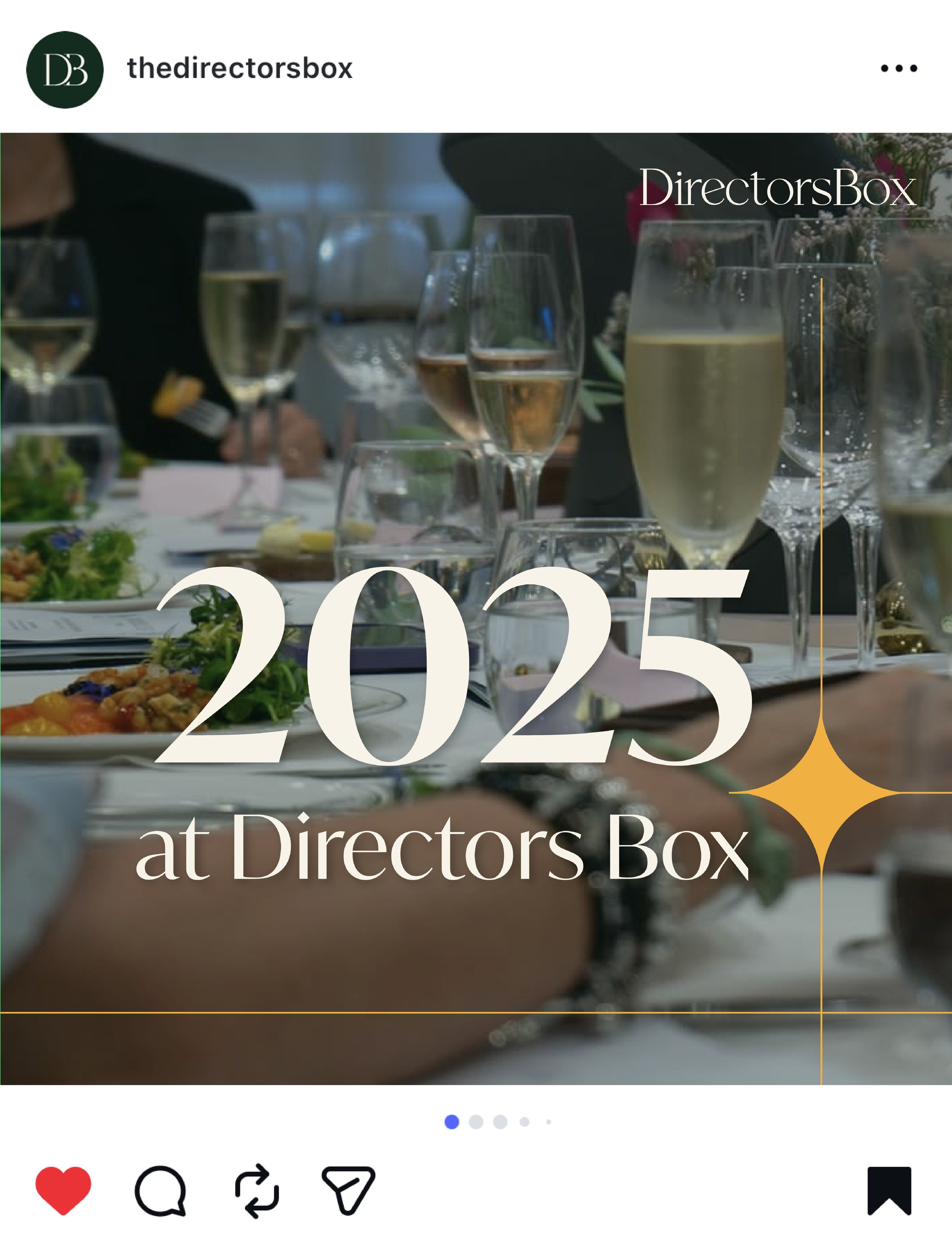
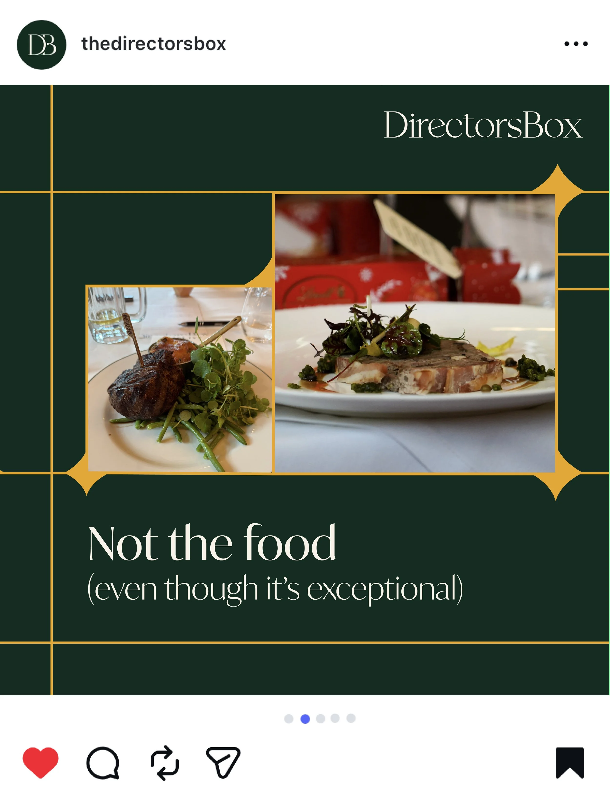
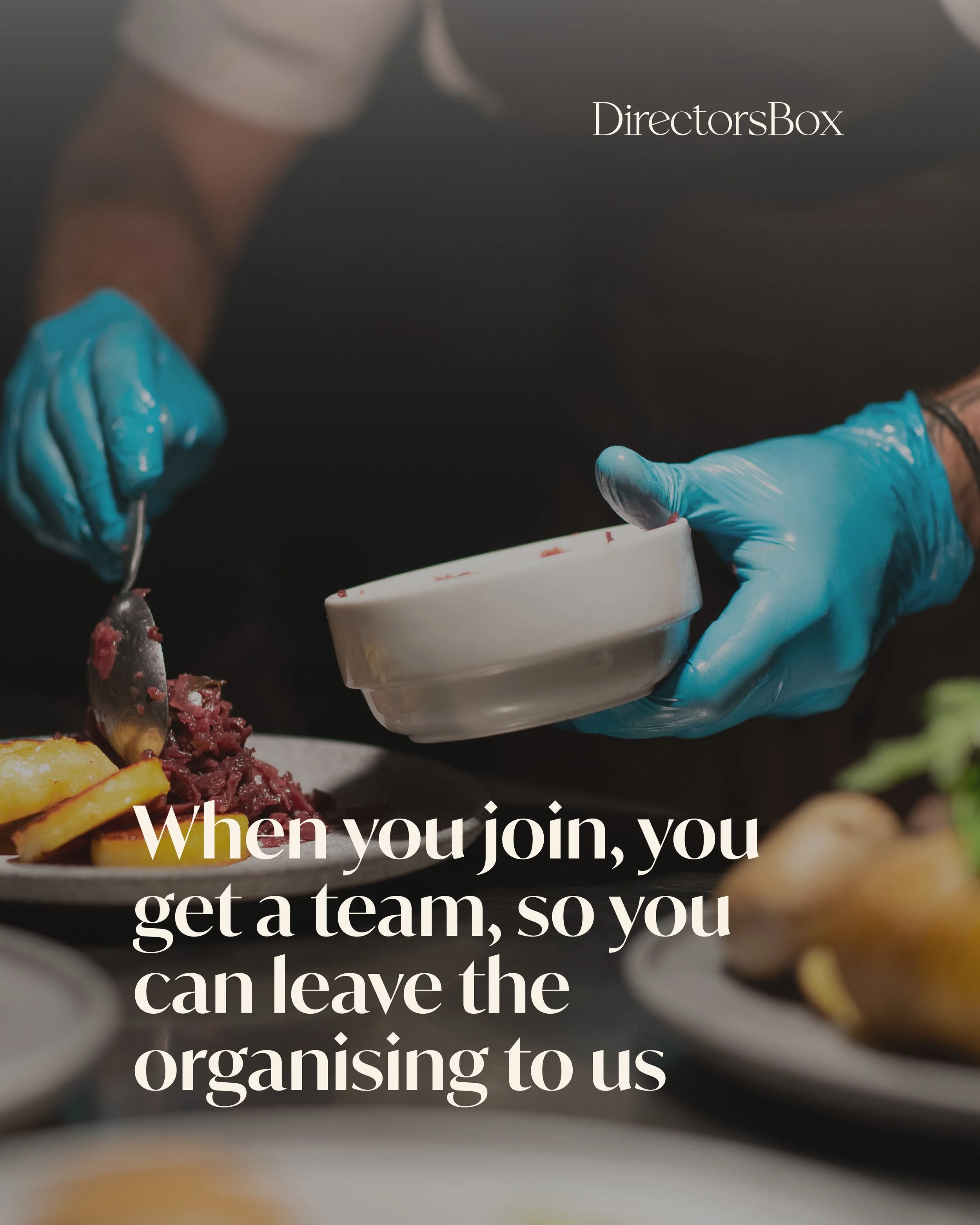
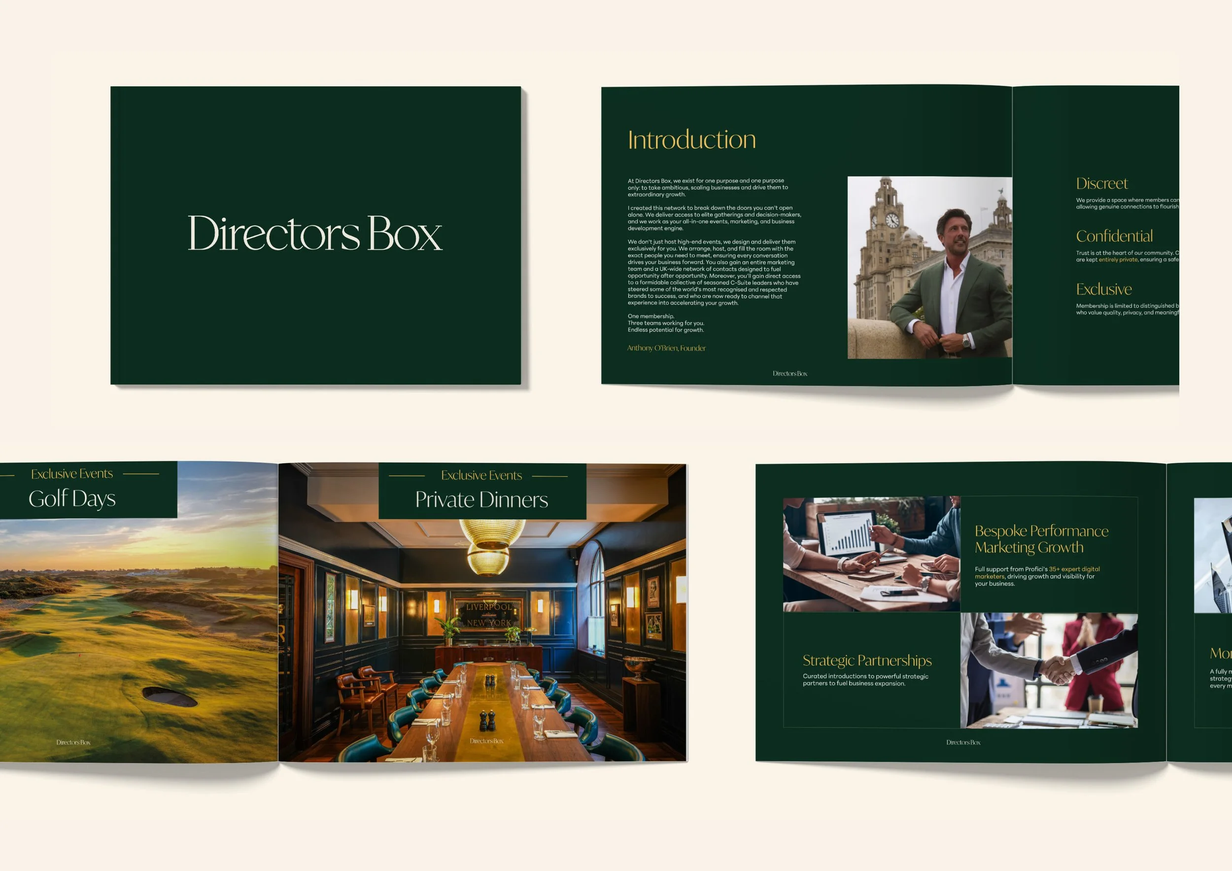
Directors Box
Problem
With only loose branding elements and unrefined logos, this private members club needed a consistent identity and alternative marketing routes to encourage membership sign ups.
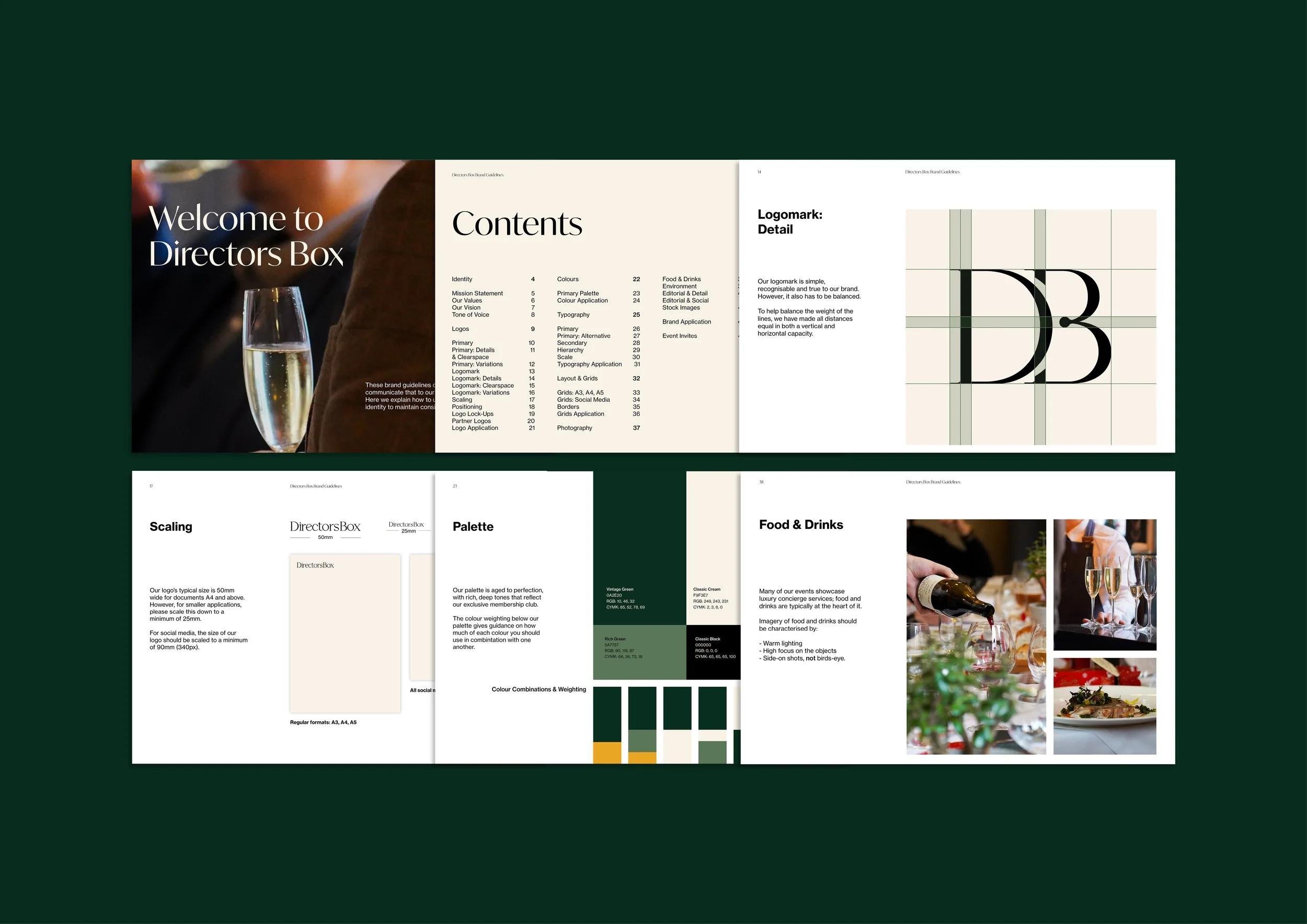
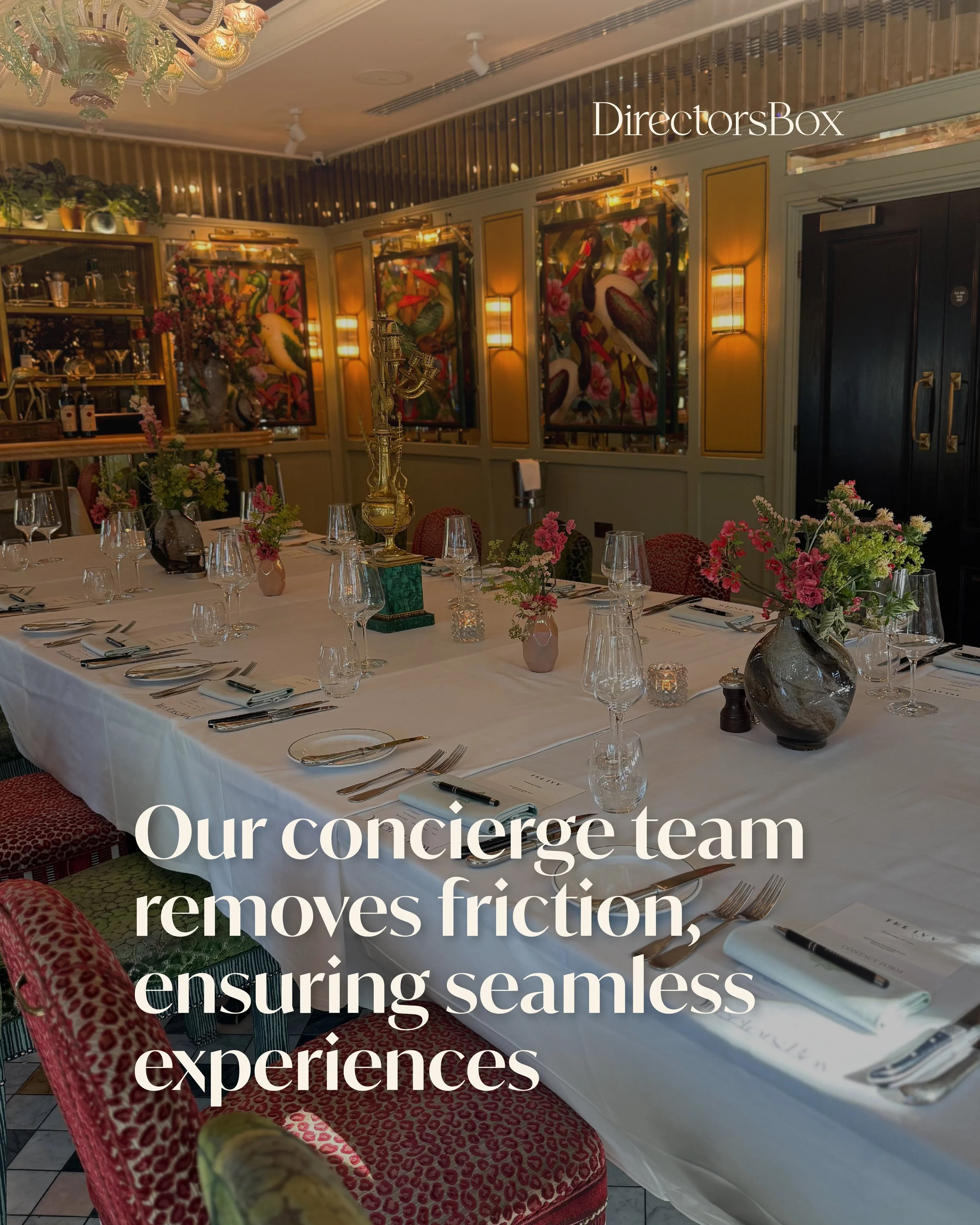
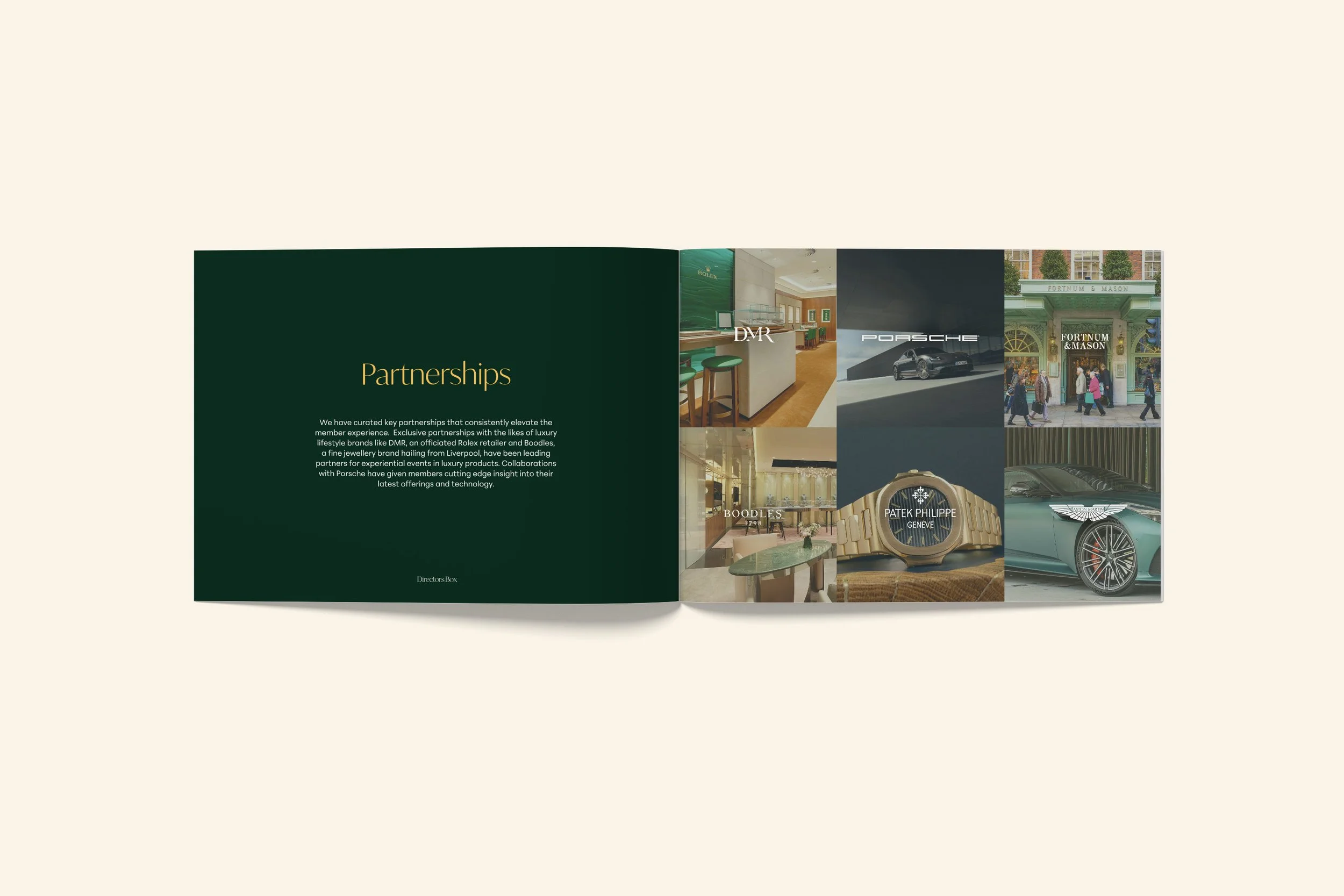
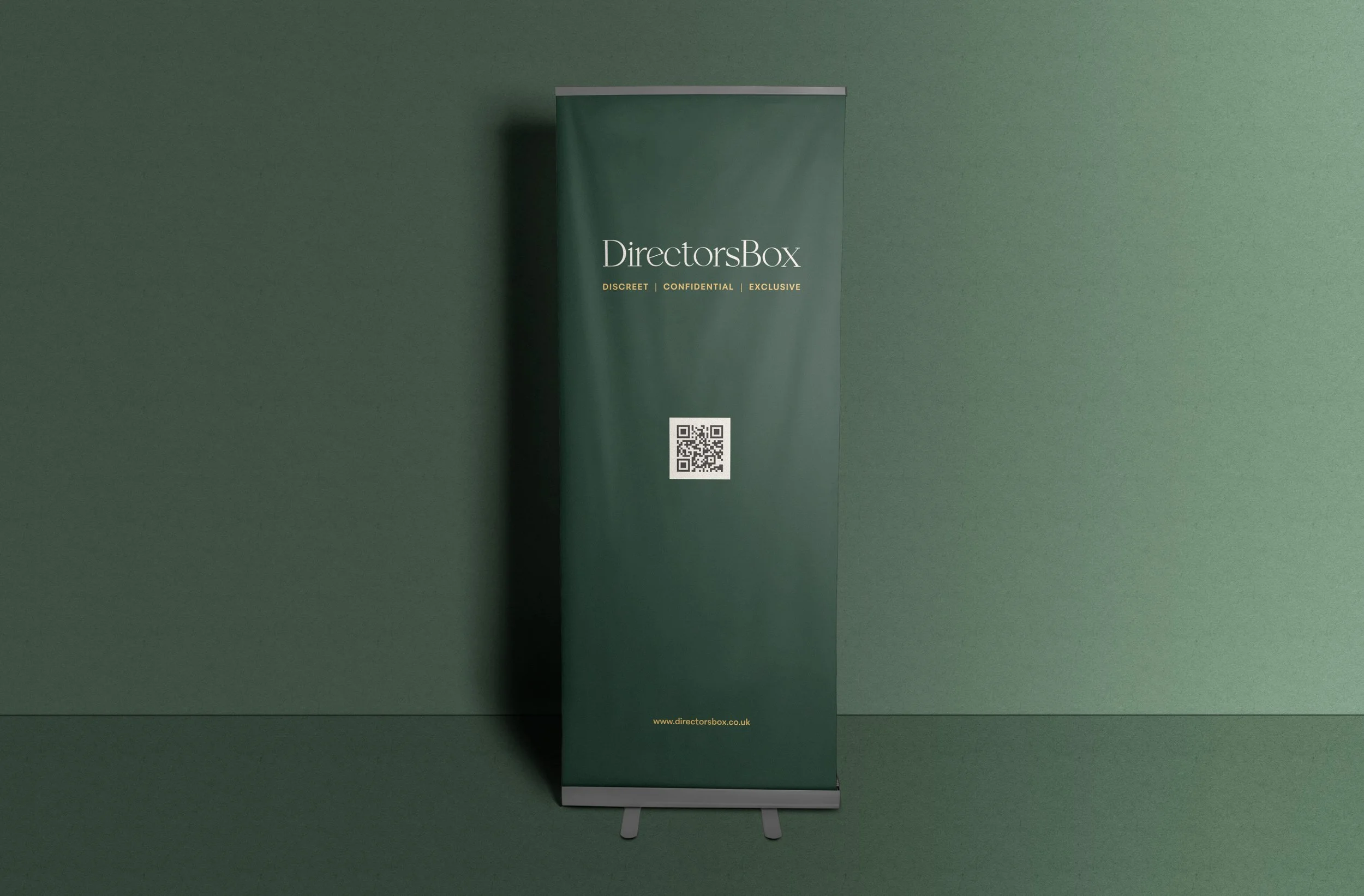
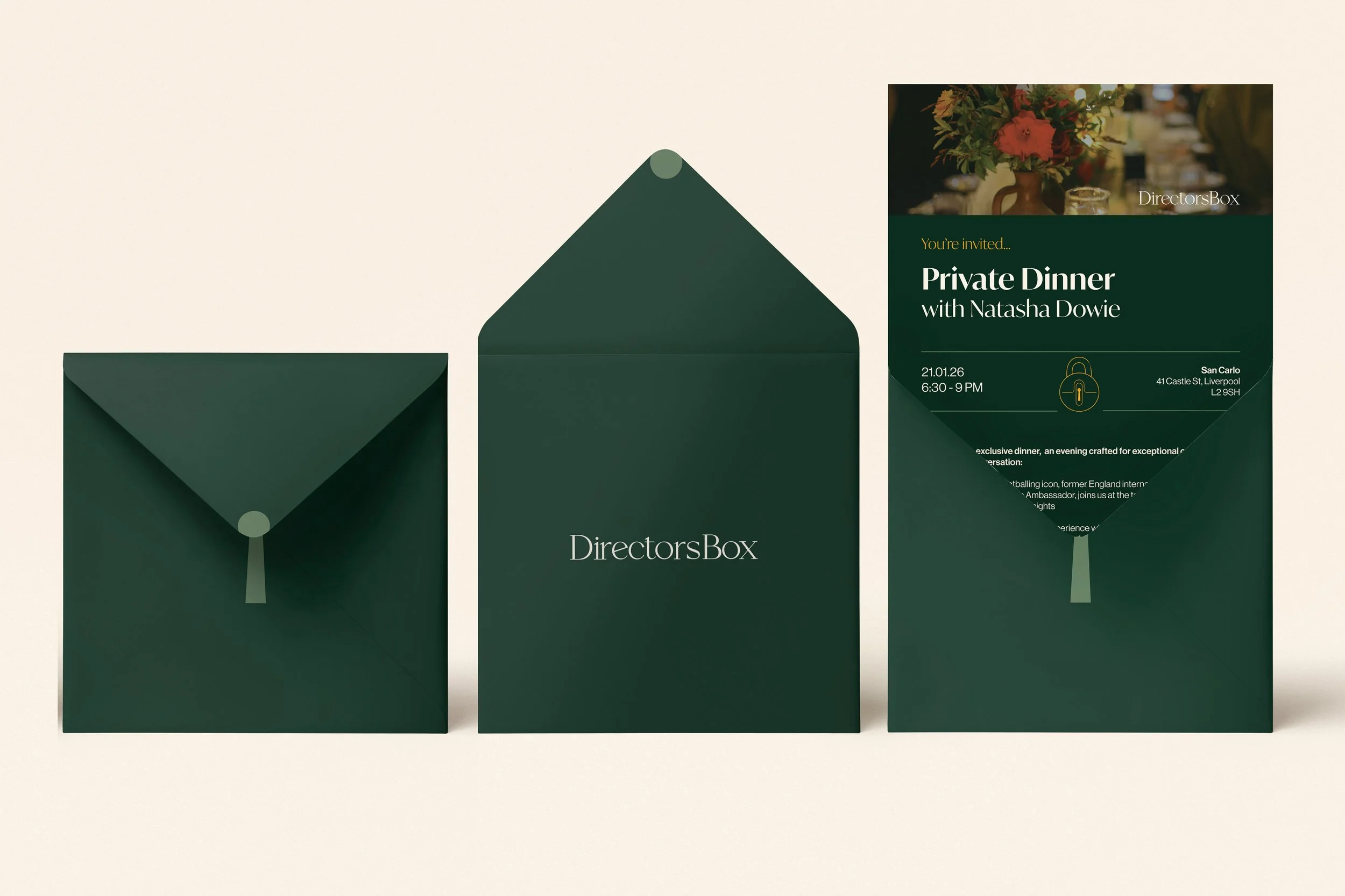
Solution
After refining the logo, with proper kerning and thickening the primary logo for legibility at all scales, I designed full brand guidelines that channeled the heart of Directors Box. As an in-house designer, I also created all social content, event promotional material and print campaigns.
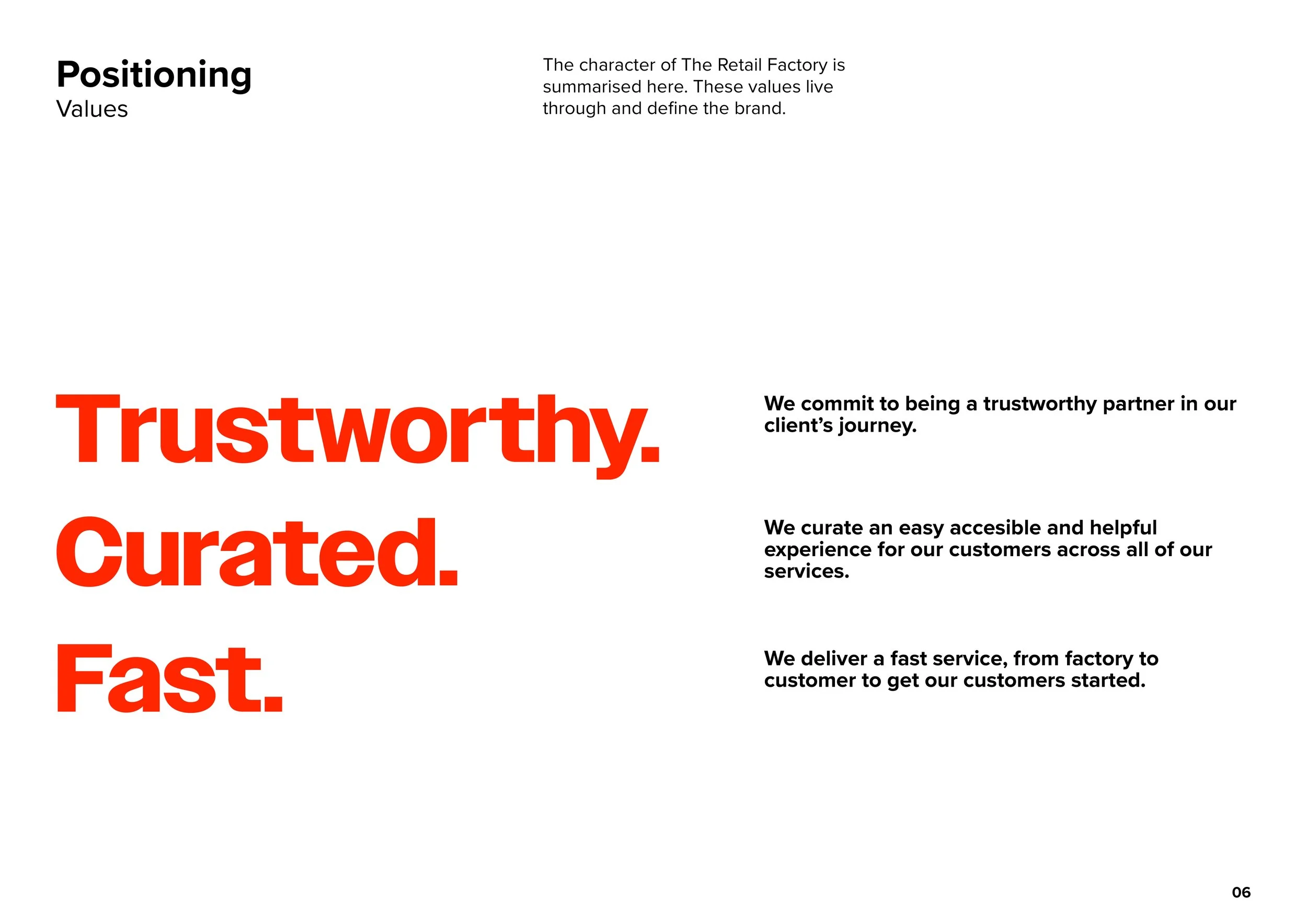
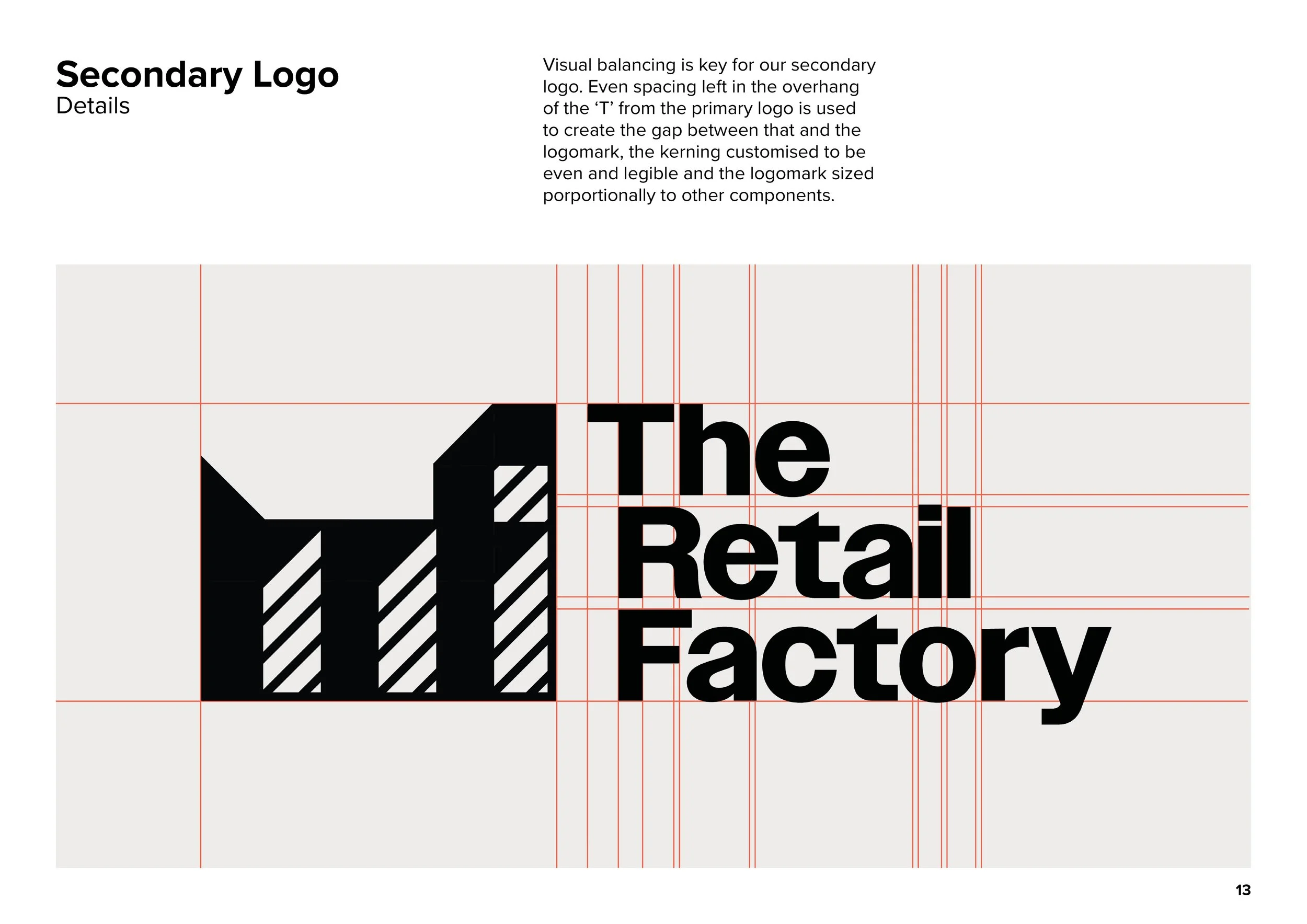
The Retail Factory
Problem

After reviewing the current branding, the client wanted a fresh identity to compete against the market.

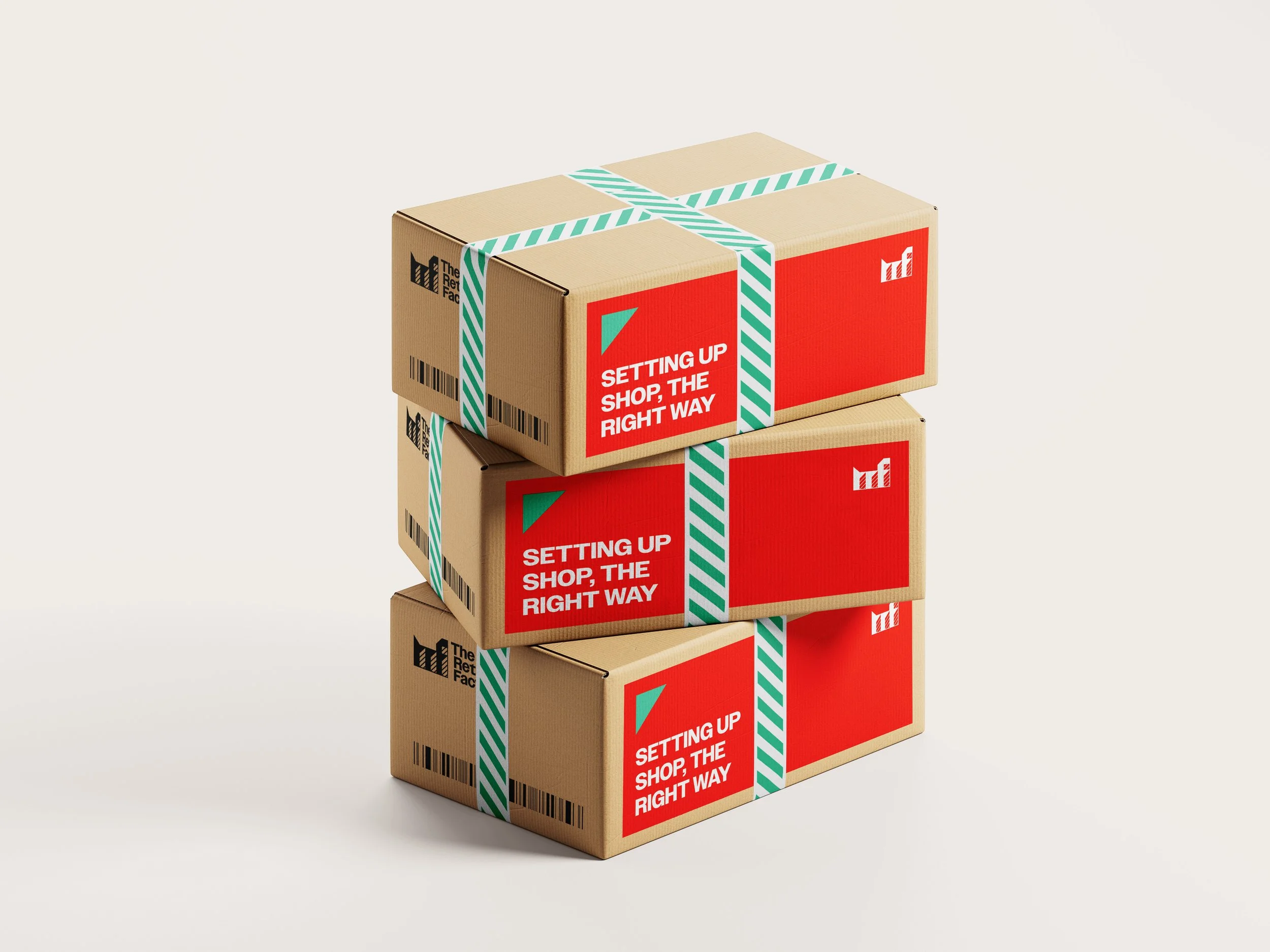
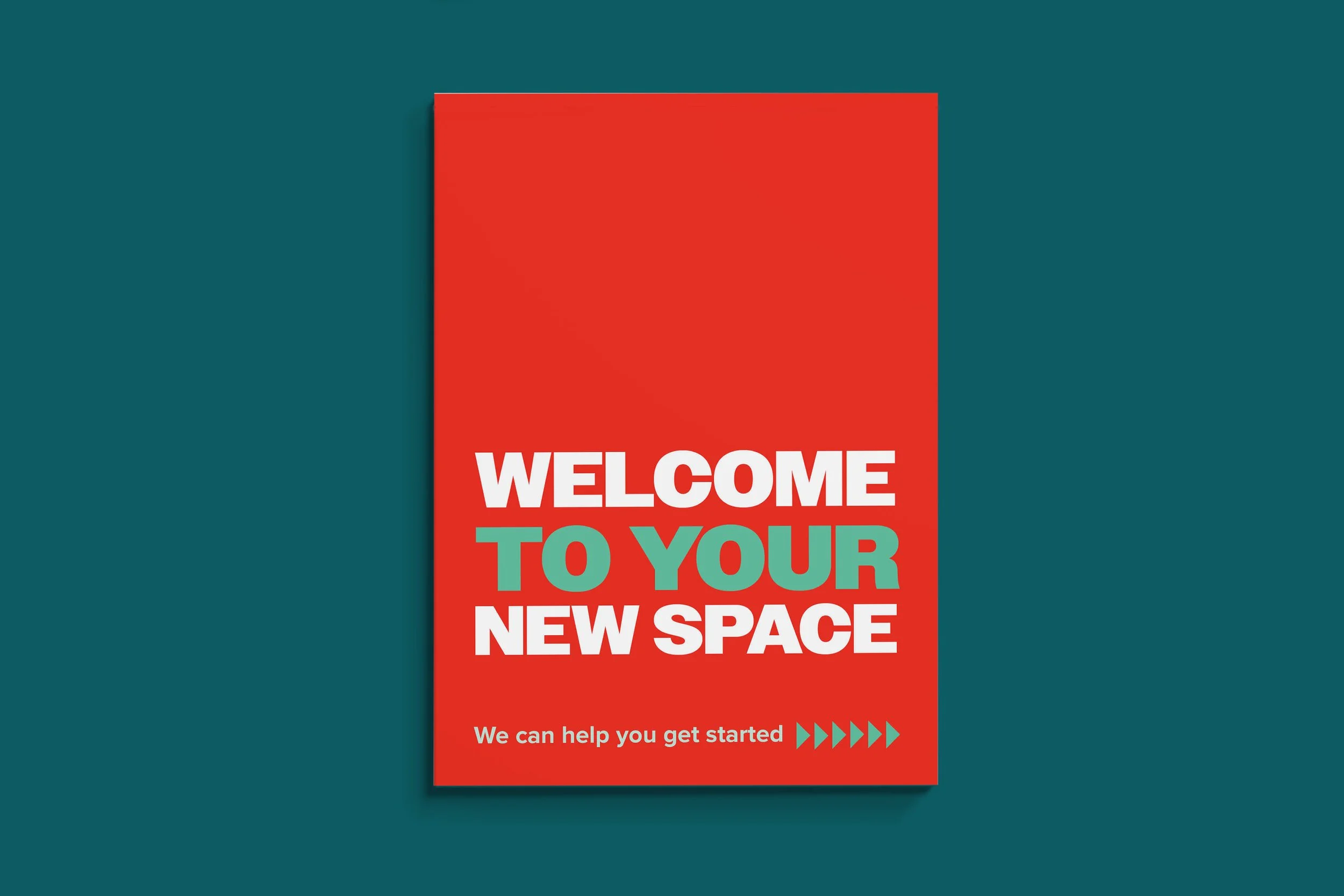
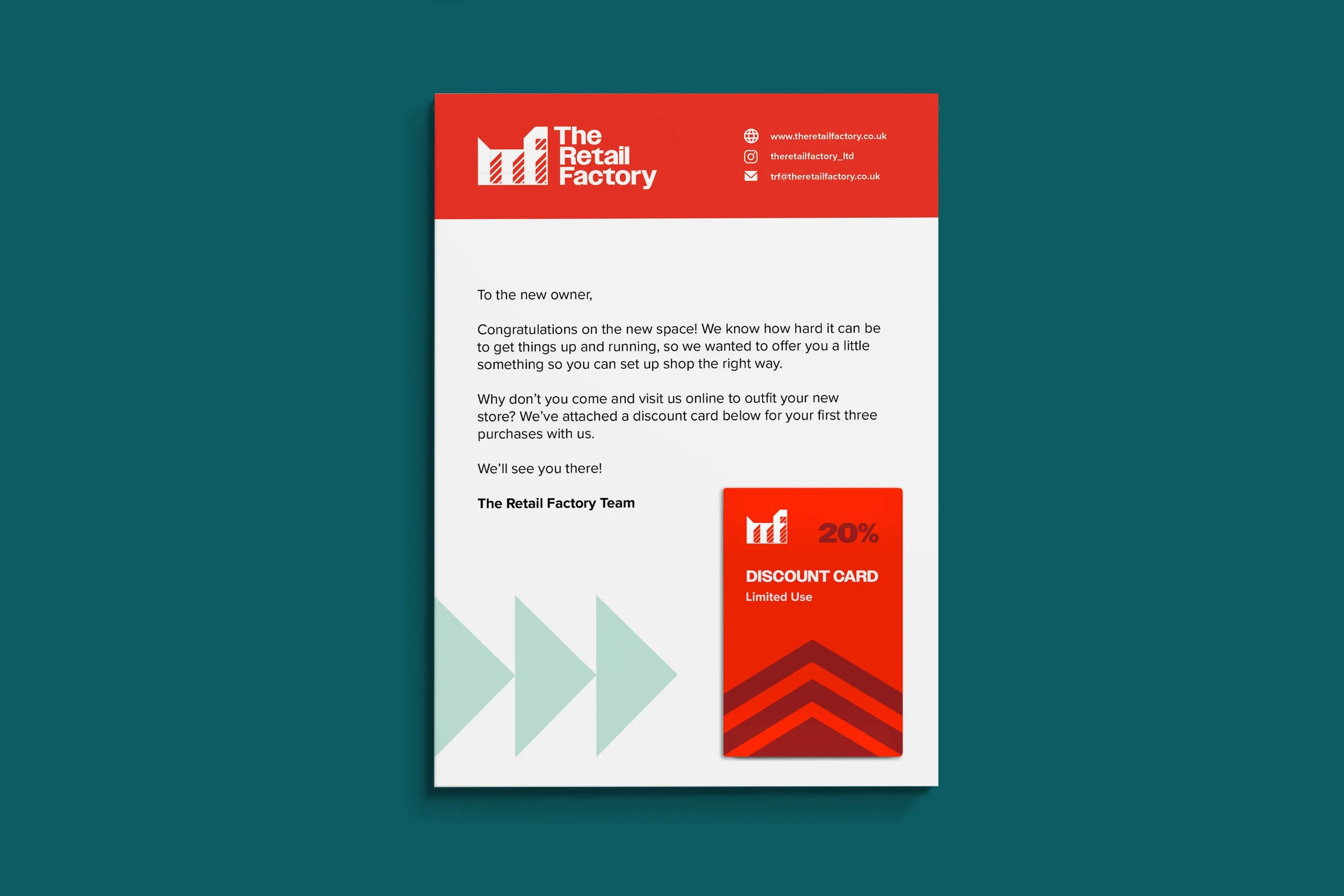
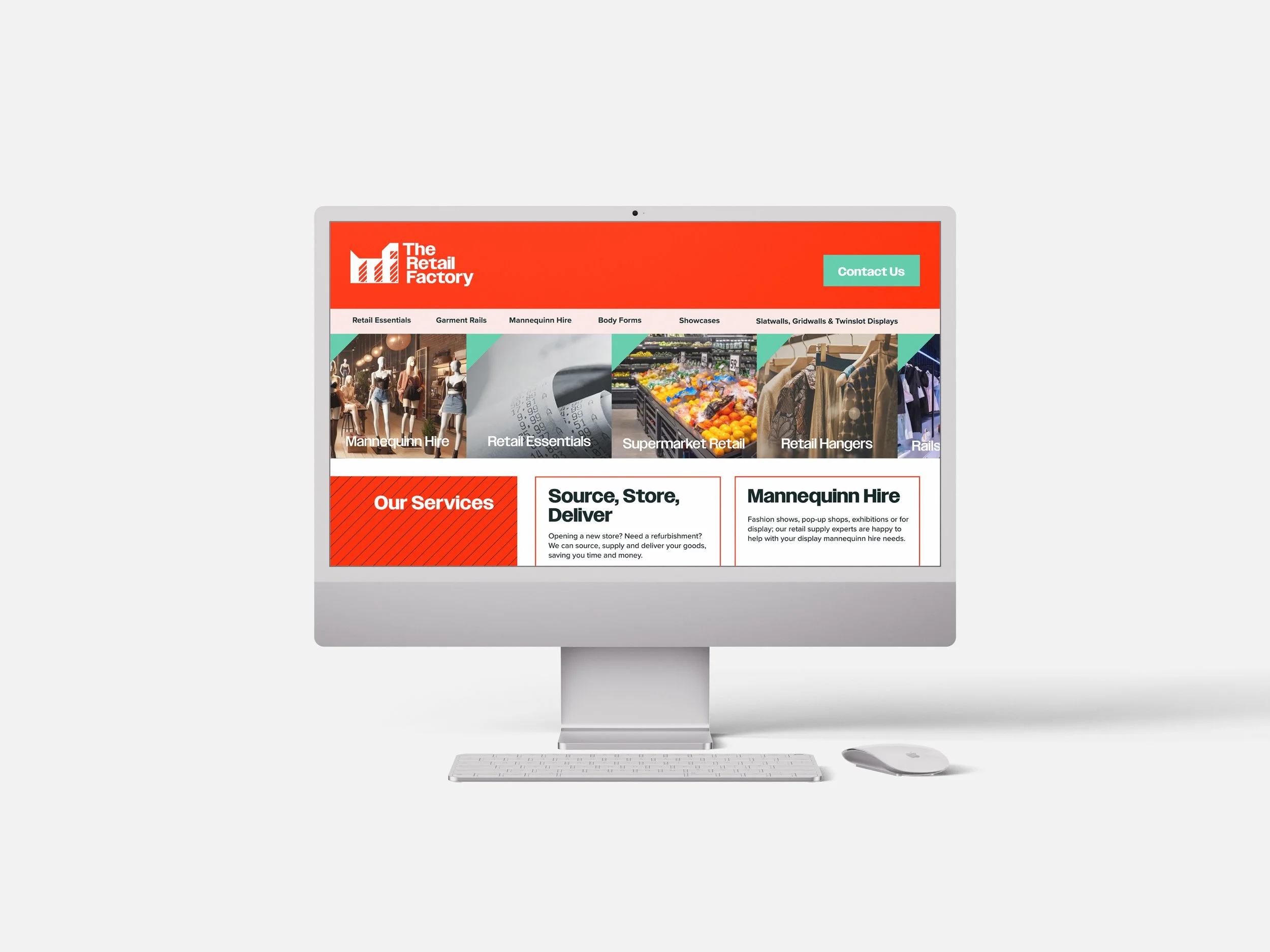
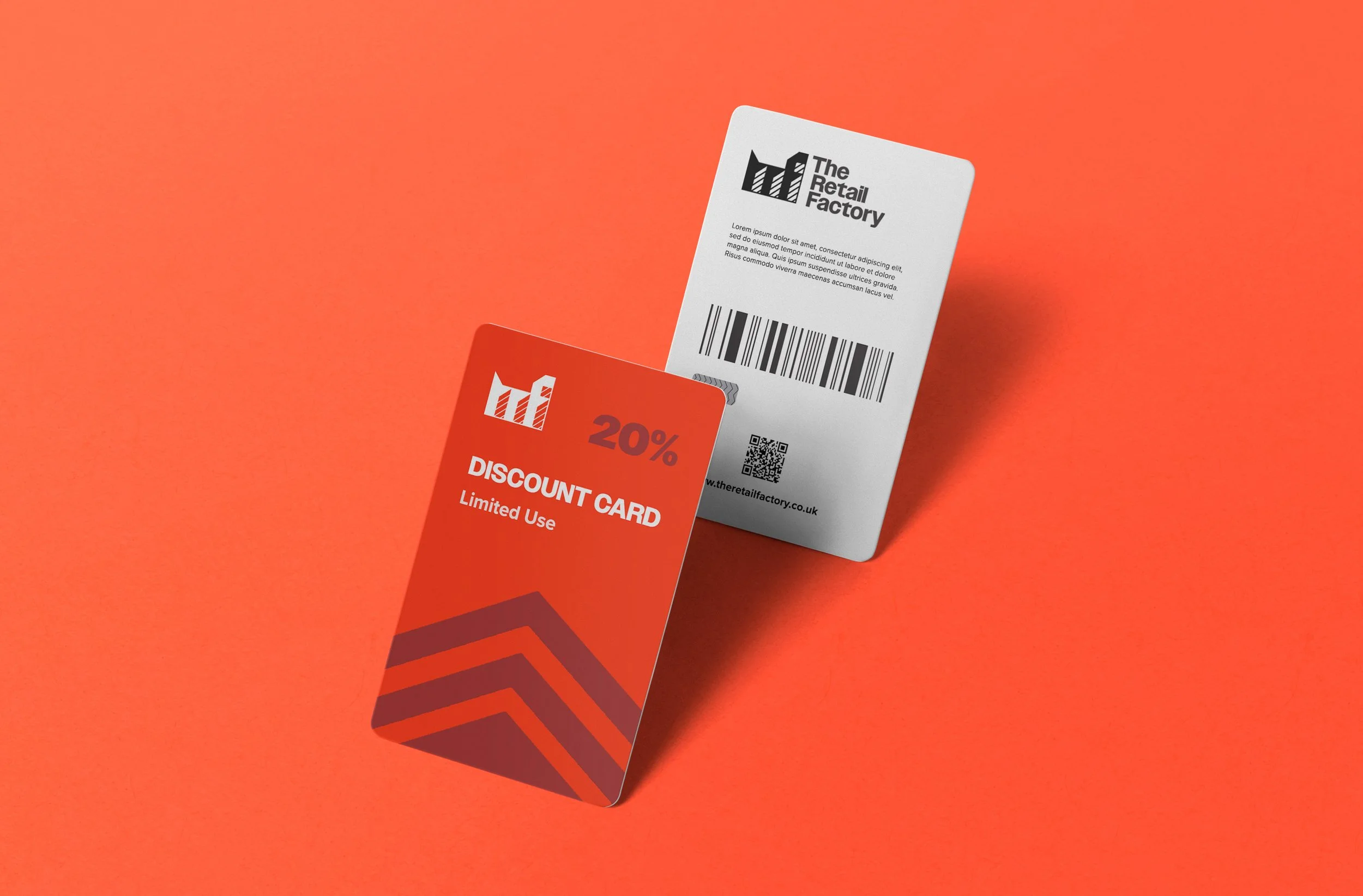
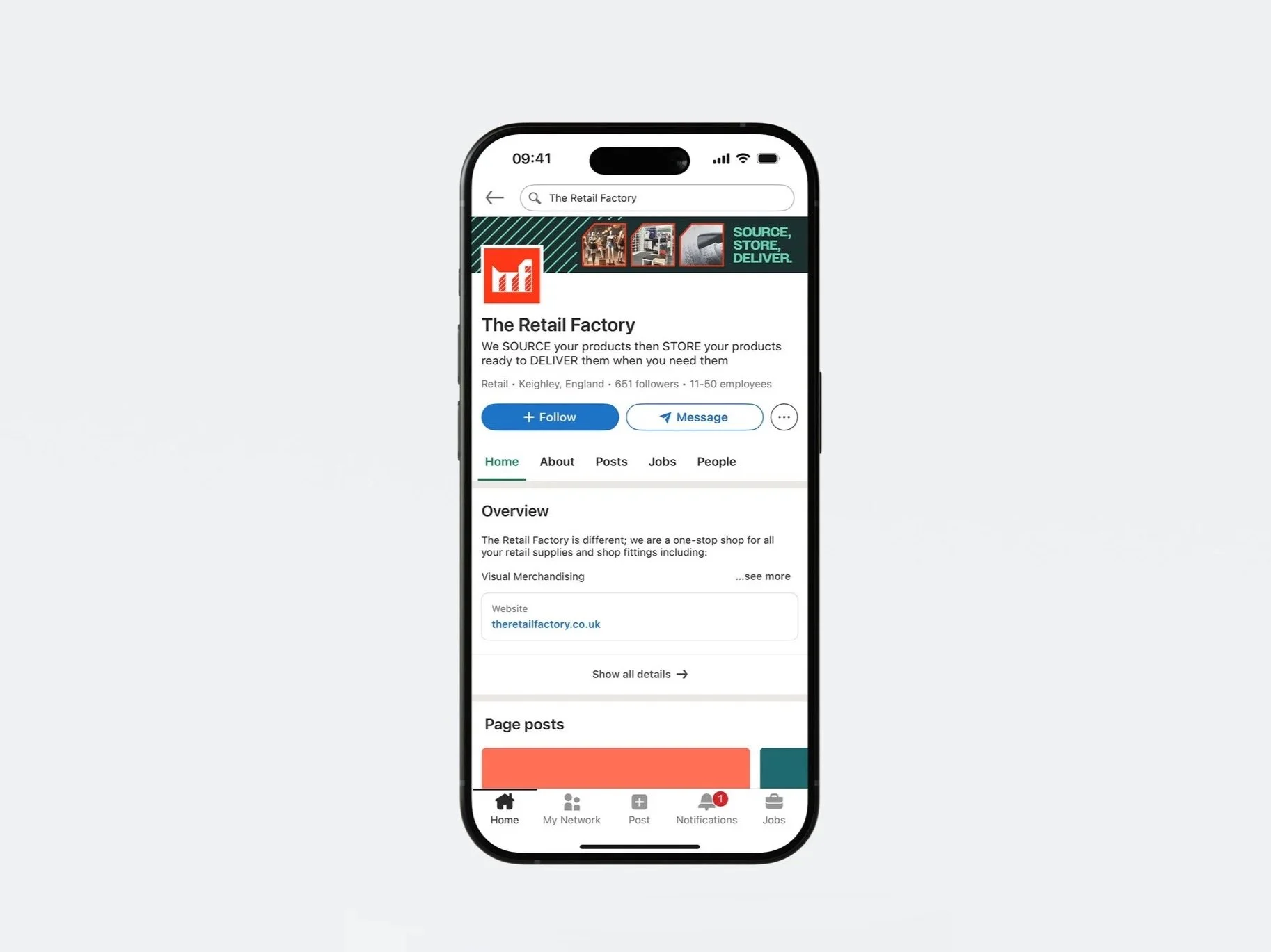
Solution
I pitched a proposal for a fresh identity that is both simple but recognisable, with consistent and clever logo design framing an inclusive identity of all services offered.
Confect
Problem
A rapid fire prospective project with a need for a variety of deliverables to test for a campaign.
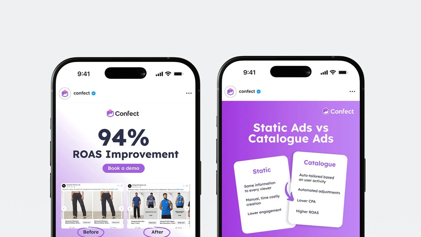
Solution
Following brand guidelines and with efficiency in mind, type hierarchy was a priority for quick readability and engagement, using real case studies with statistics to emphasise trust in the brand.
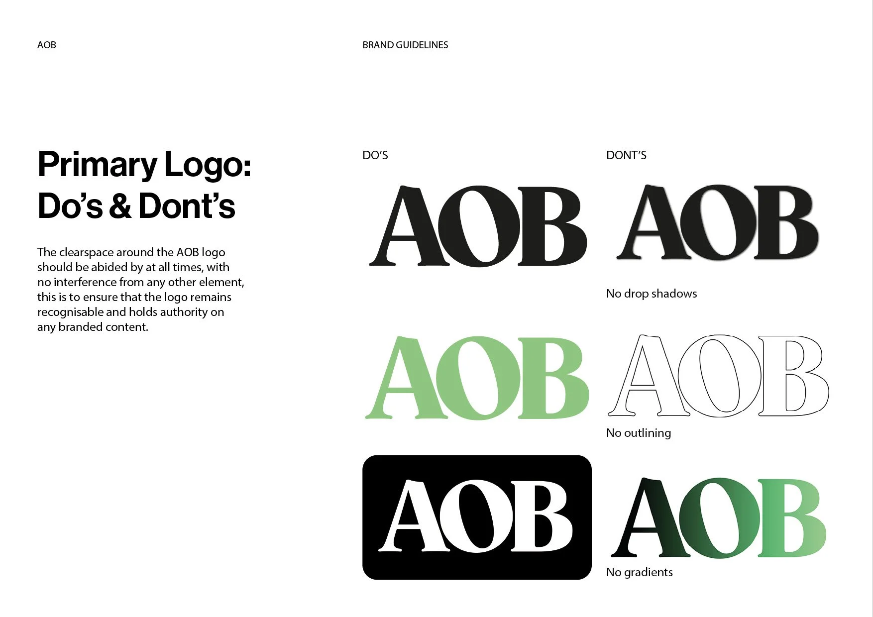
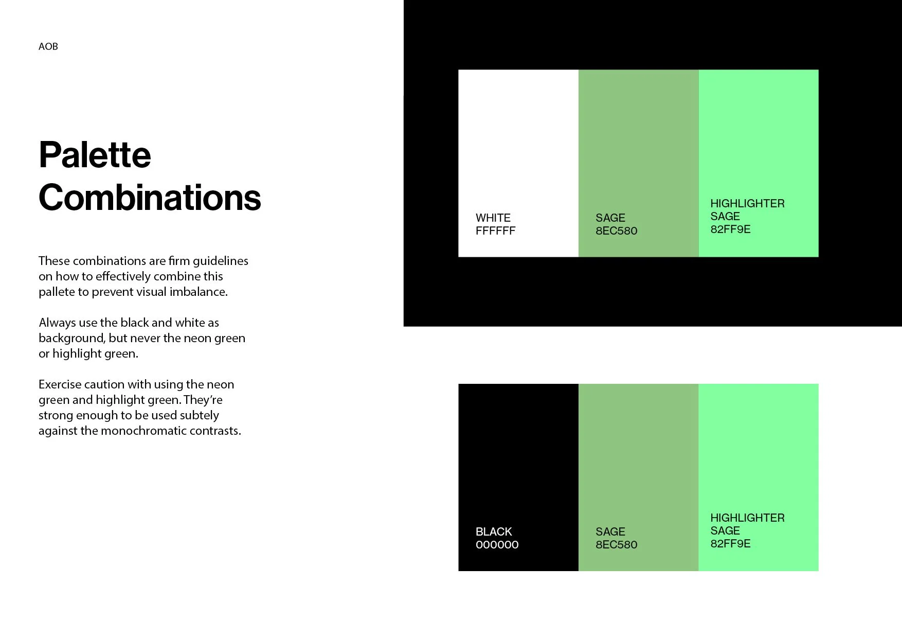
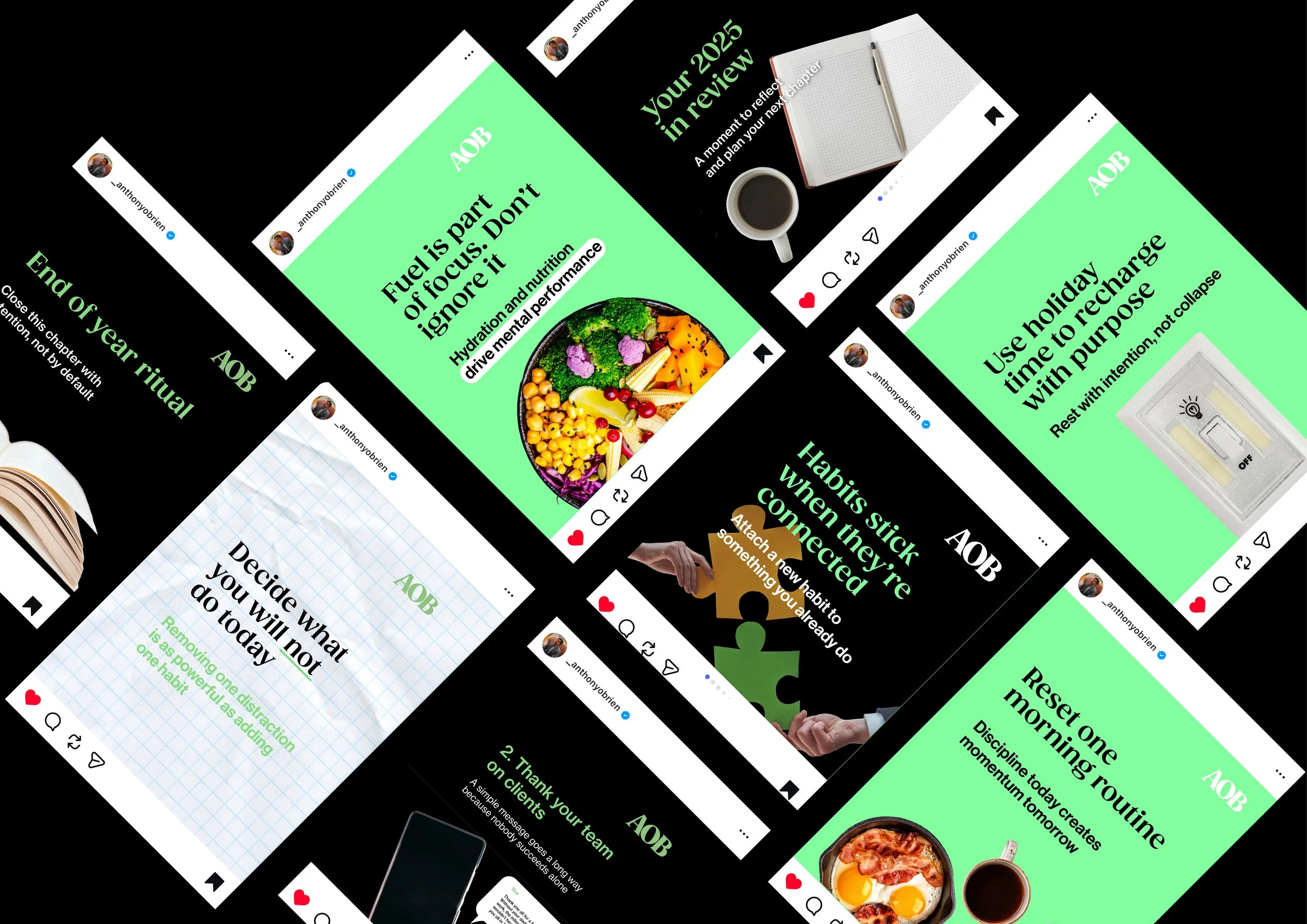
AOB
Problem
At Profici there were clients that didn’t have the budget to access fractional services but still desired business advice.
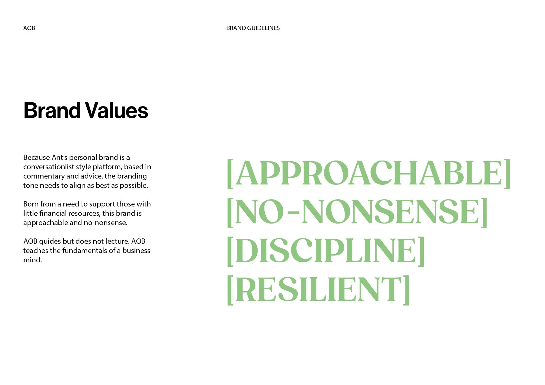
Solution
I collaborated on the logo with a creative director, emphasising the ‘no nonsense’ feel by keeping it simplistic but recognisable. However, I developed the brand guidelines including positioning, layout guides, logo details and colour palettes. From this I created social media templates and designed the content that was posted.
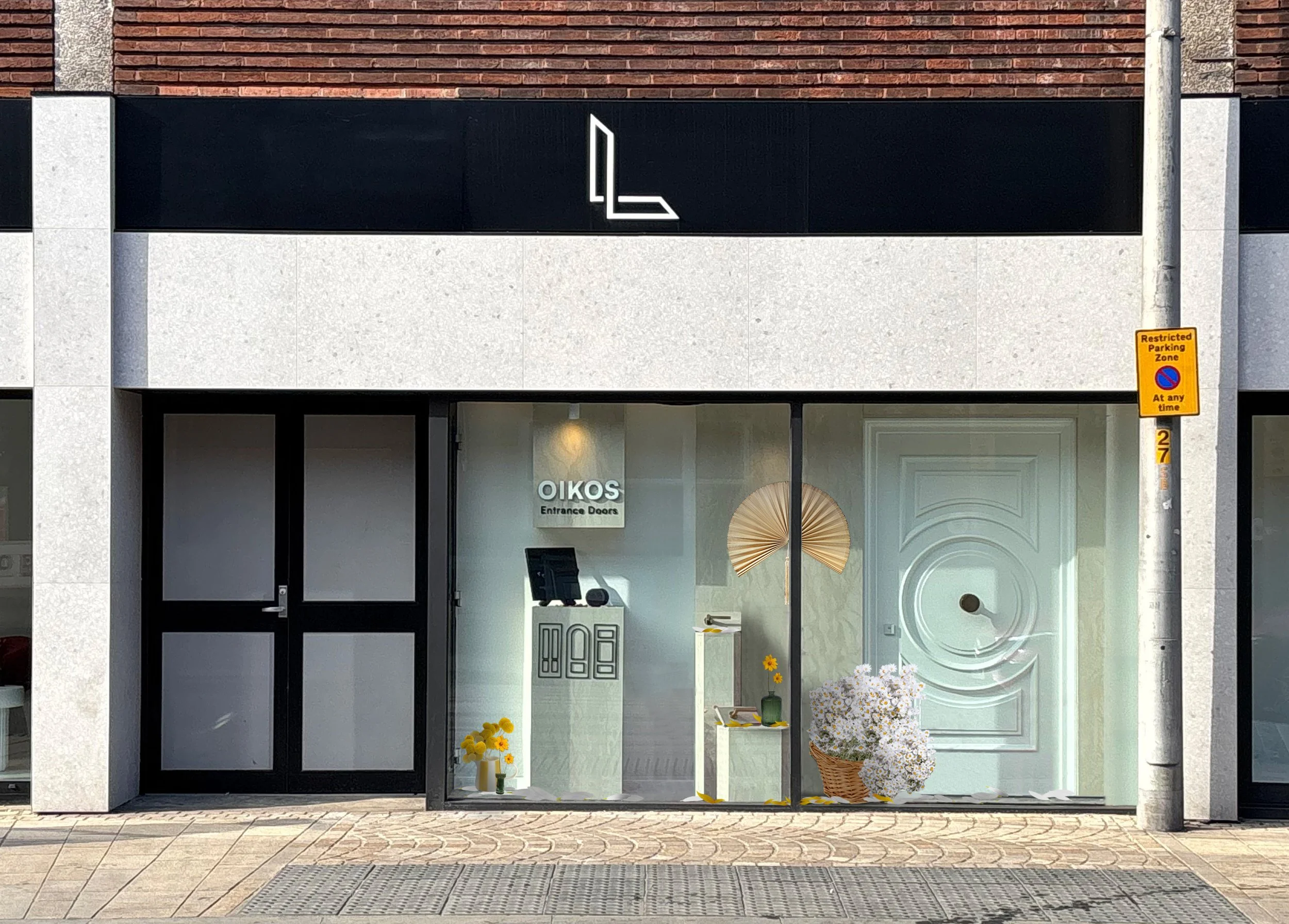
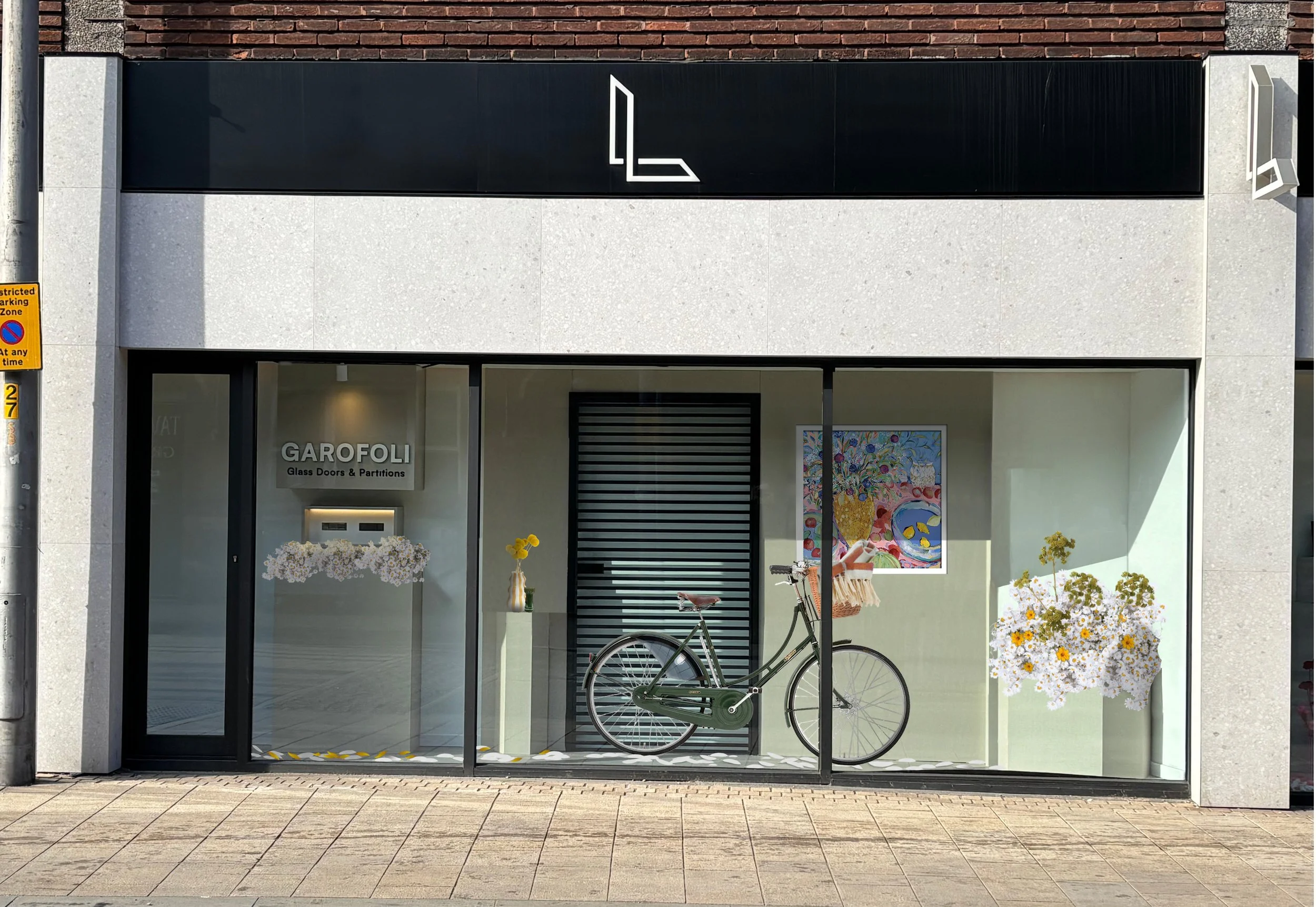
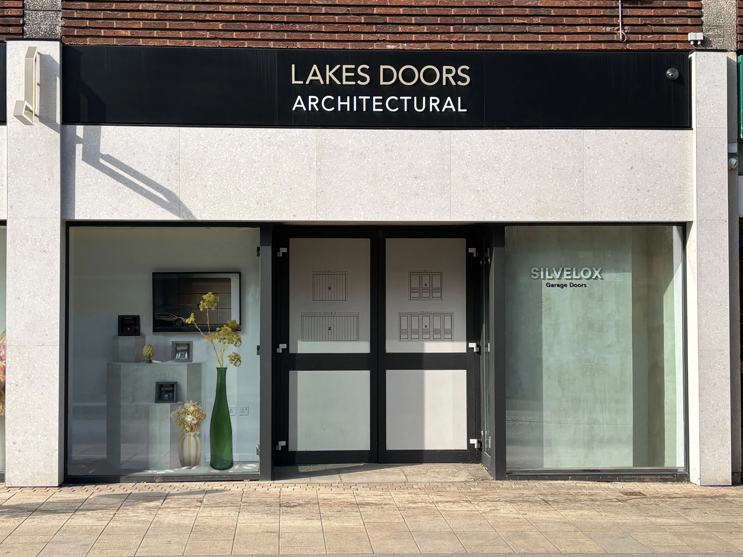
Lakes Doors Architectural
Problem
With the client projects bustling at Lakes Doors, there were neglected areas that needed some attention. One such project was the visual merchandising of the showroom, where the team was struggling to curate the displays in a creative but tasteful way that reflected the high-end luxurious tone of the business.
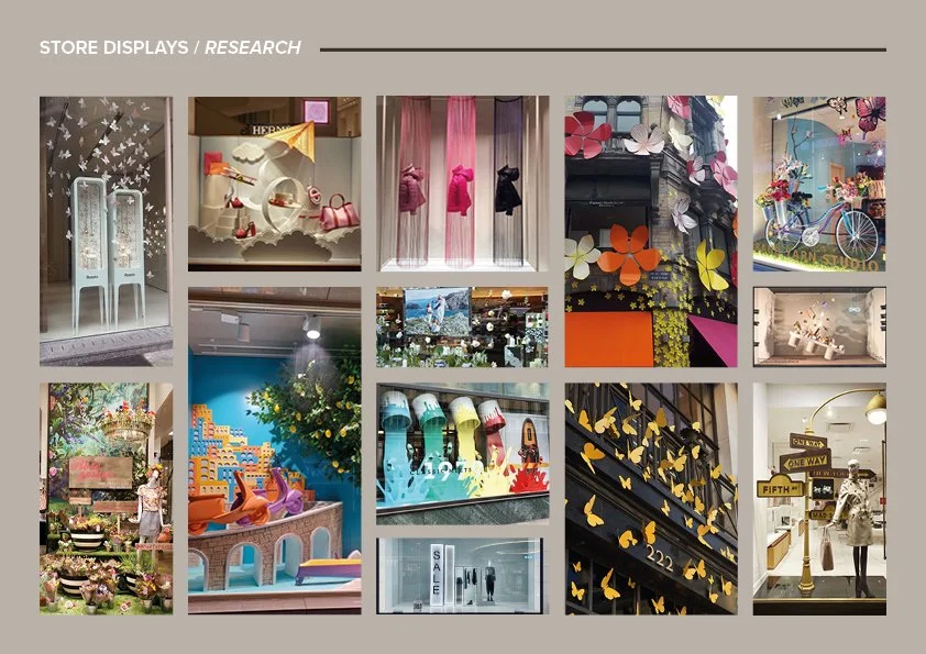
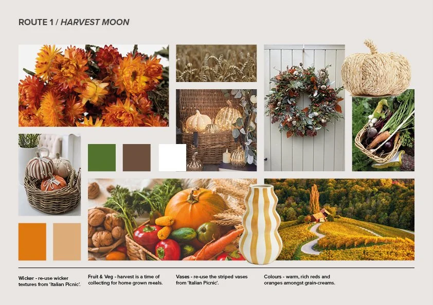
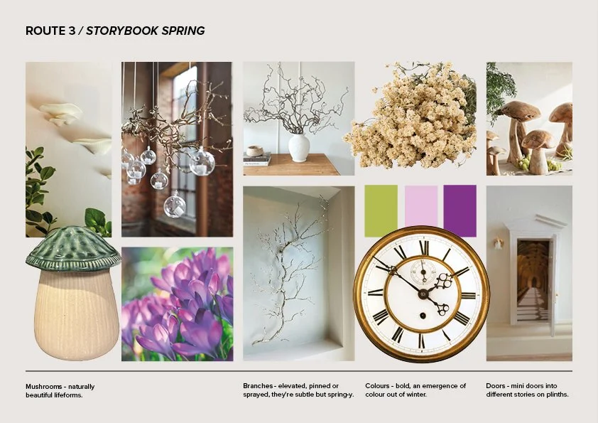
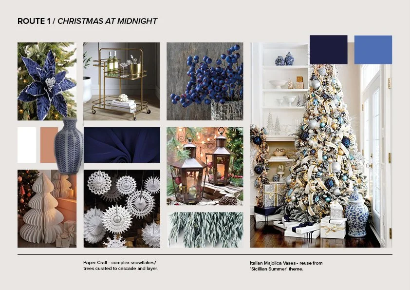
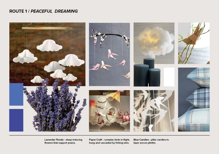
STAGE 1: IDEATION
I collated the strongest ideas for each season into moodboards and presented them to the team. Included in the annual calendar were local events, like ‘Paint Altrincham Pink/Blue’ to help forge a closer connection to the local community.
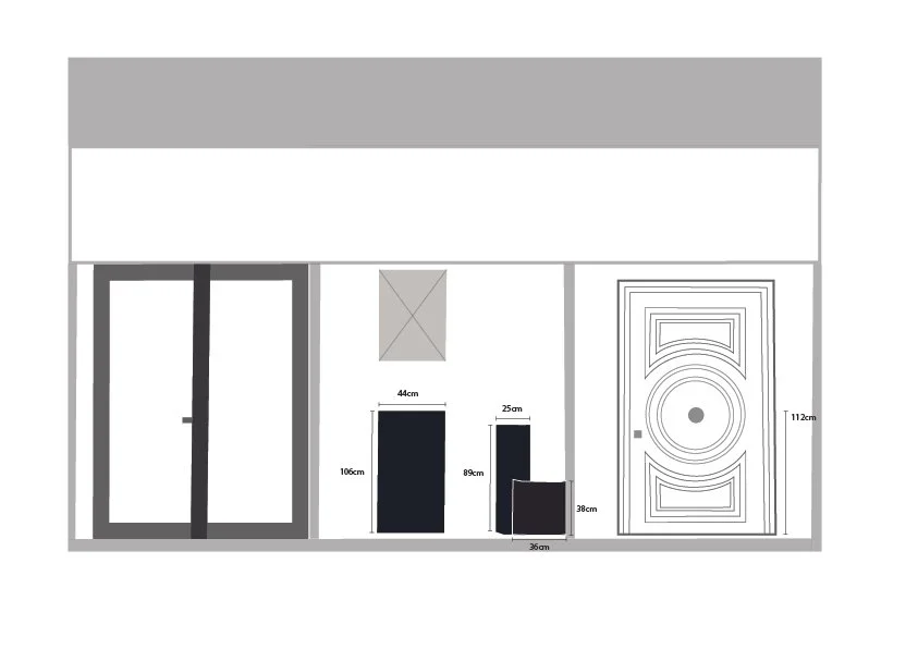
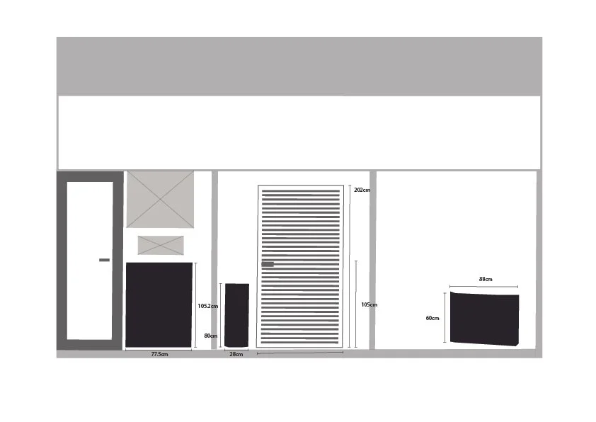
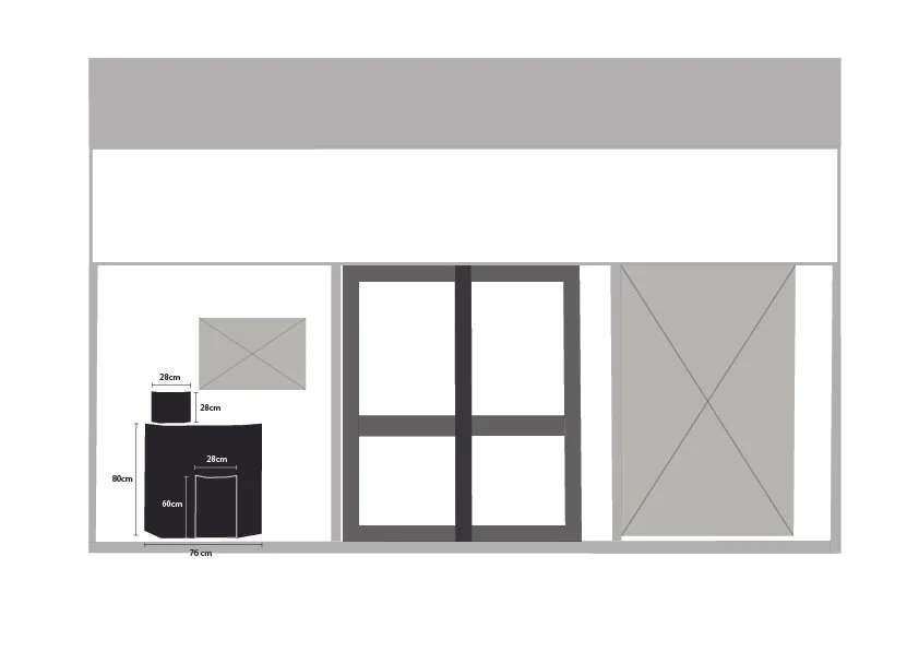
STAGE 2: TECHNICAL DRAWINGS
With themes approved, I measured out the creative space I could work with. From there, I sketched up technical drawings with all replaceable elements shaded in. Black for plinths and grey for brand promotions/art pieces/design features.
STAGE 3: MOCK UPS
I photographed the windows that were being used for merchandising and edited out the visual arrangements already there, keeping only the necessary elements. From there, I placed and edited imagery of the items I’d sourced from collaborating businesses in the local area to national stores.
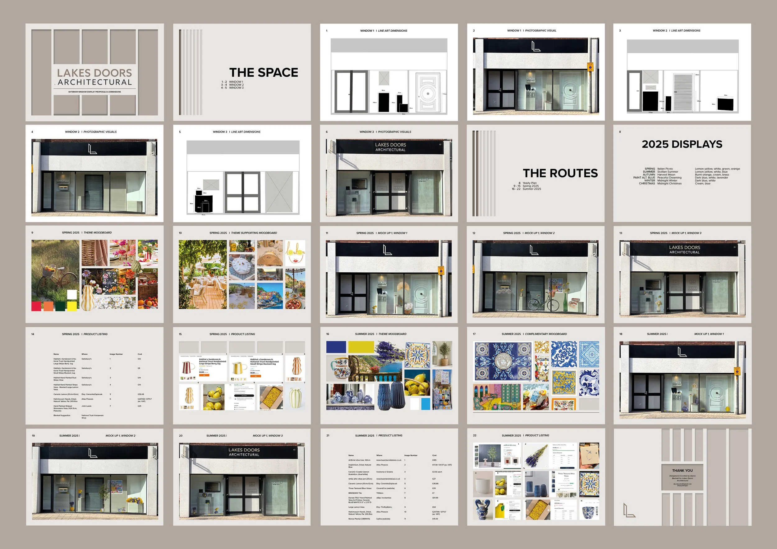
STAGE 4: CURATING THE PROPOSAL
I demonstrated my creative process through all stages, expanding from size accurate mock-ups and thorough product listings to moodboards. I placed emphasis on spring and summer as they were the nearest seasons to exhibit.
Solution
I collaborated with the team to create an annual plan for the showroom that was founded on subtle taste, effective budget and brand tone.